Cinematic Agency Consultation
Anchored to Stodio · captured 2026-04-20 · Webflow template by stodio.studio / Codexzel
Thumbnails
Scroll recording
~18s auto-scroll pass from top to bottom. Shows entrance animation, scroll-driven reveals, and carousel momentum.
Scroll checkpoints · 11 frames (0–100% scroll)
Hover probes · 6 before/after pairs


Design spec
Page Anatomy — Cinematic Agency Consultation (Stodio exemplar)
Scroll evidence: scroll-000.png through scroll-100.png (11 frames, 0%–100% of 10,257px total page height). Viewport: 1440×900px. All section positions are estimated against that total height.
Section 1 — Navigation Bar
Position: Fixed top, full-width; visible at all scroll depths
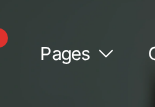
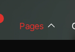
Layout: Three-zone horizontal bar, ~60px tall. Left: red cluster logo mark (geometric dot pattern) + "Stodio®" wordmark in white Inter. Center: links — Home, Studio, Project, Pages (dropdown), Careers, Contact — in Inter ~14px, white, weight 400. Right: pill CTA "Book a free >" in red fill (#E63329), white text, Inter 14px, weight 500. All items on a near-black background (#0D1117) that appears as a slightly cool dark distinct from the pure black body.
Visual: Nav background is fractionally different from the hero background — subtle separation at the top edge. Logo mark uses the same red accent as the primary CTA. The "Pages" item shows a dropdown chevron (observed toggling from ∨ to ∧ in hover-probe 4).
Conversion rationale: The single red CTA in the nav ("Book a free >") is the only colored element in the navigation zone, drawing the eye immediately. Low nav link count keeps exit paths minimal. The persistent fixed position means the CTA is reachable at every scroll depth without the user needing to scroll back up.
Section 2 — Hero
Position: 0–13% scroll (scroll-000.png)
Layout: Two-zone split, approximately 55/45 left/right. Left zone: eyebrow label + headline + three service tags + two CTAs. Right zone: cinematic portrait photograph, right-aligned, bleeding toward right edge. Background: full-bleed near-black (#0A0A0A).
Visual details:
- Eyebrow: red dot icon + "Next-Gen Design Agency" in small Inter, white, uppercase, wide tracking
- Headline H1: "Next-Gen Design Agency for Growing Brands." — Stack Sans Headline, ~80–90px, weight 800, white, tight tracking, 3 lines
- Below headline: three service labels "Branding / Mobile & Web App Design / for Startups and Giants" in smaller Inter, lighter grey weight
- CTAs: "View Projects >" (red pill button) + "Reach Out >" (ghost/text link), side by side
- Below the three CTAs: three horizontal tab-style labels "Define / Design / Development" as small inline items with "+" prefix icons
- Right column: a cinematic motion-blur portrait — man in dark clothing, slightly blurred torso, head cropped at top. Photography is desaturated-warm, backlit, high-contrast. The image occupies the right 45% of the viewport, no hard border — blends at left edge into the dark background.
Conversion rationale: The headline is the value proposition. "Growing Brands" is the audience signal, "Next-Gen" is the quality promise. The two CTAs give a choice: see work (lower friction) or contact directly (higher intent). Three process labels ("Define / Design / Development") pre-answer the "how do you work?" objection before the reader even asks. The dark cinema background + motion-blur photography makes the above-the-fold feel premium rather than templated.
Section 3 — Logo Ticker / Social Proof Bar
Position: 13% scroll (scroll-010.png, upper portion)28–32px height), equal spacing, no dividers.
Layout: Full-width horizontal ticker strip on white background. Small eyebrow text left-aligned: "WE'VE DONE 500+ ENTERPRISE AND BUSINESS CONSULTING" in Inter ~10px, muted grey. Followed by an auto-scrolling horizontal marquee of client/partner logos: ZeedyBite, NexaTech, LuxeAura, DigiMinds, and additional logos cropped at right edge. Logos appear in monochrome (dark grey on white).
Visual: Sharp contrast flip from the black hero to pure white. The ticker creates the impression of continuous motion — the only ambient motion on the page. Logo marks are small (
Conversion rationale: Immediate credibility signal after the hero. "500+ enterprise and business consulting" sets scale. The horizontal scroll implies the list of clients is too long to show all at once — a quantity signal. Positioned early so skeptical visitors get evidence before investing more scroll time.
Section 4 — About / Studio Introduction
Position: ~13–22% scroll (scroll-010.png, lower portion)
Layout: Two-column asymmetric, approximately 60/40. Left column: eyebrow label "Who we are" + large display headline spanning two lines. Right column: text link "ABOUT THE STUDIO →" right-aligned.
Visual:
- Eyebrow: small red square icon + "Who we are" in Inter, small, muted grey
- Headline: "We build search-first digital systems to help category leaders lead their industries." — Stack Sans Headline at ~56–64px, near-black text on white ground, weight 700, tight tracking. "category" is rendered in italic/lighter weight as a visual accent mid-phrase
- Below: a 4-column equal-width image strip begins — portrait-oriented editorial photographs. First image has warm amber/skin tone (a face illuminated from side), second is dark black, third is orange-gold with figure in motion blur, fourth is deep pink-red dramatic. These are cinematic, heavily graded, close-cropped faces and bodies in motion.
- Right: "→ ABOUT THE STUDIO" in Inter small caps, right-aligned, grey
Conversion rationale: The headline signals strategic value ("search-first digital systems") over aesthetic services — positions the agency as a growth partner, not just a visual shop. "Category leaders" implies the agency works with serious companies. The four editorial photographs immediately establish the visual taste level — no stock photography, no generic office shots.
Section 5 — Stats / Numbers Bar
Position: ~22–27% scroll (scroll-020.png, upper portion)
Layout: 4-column equal-width horizontal bar, light grey background (#F2F2F2 approx.), contained within the page width. Each column: large numeral + label + short description line.
Visual:
- Eyebrow: small red square + "NUMBERS" in Inter, small caps, grey
- Column 1: "1%" / "Expert-Vetted" / "Recognized in the top 1% of freelancers for consistent quality, trust, and expertise."
- Column 2: "30+" / "Clients served" / "From startups to giants — each treated like our only one."
- Column 3: "100%" / "Success Score" / "All 5-star reviews. No compromises. No 'but okay.'"
- Column 4: "8+" / "Years of expertise" (partially cropped in capture)
- Numerals rendered in Stack Sans Headline, ~56–72px, near-black, tight tracking. The "+" and "%" suffixes appear in the same size/weight as the numeral proper — no superscript treatment.
- Light divider lines between columns
Conversion rationale: Four hard numbers that address the two primary agency buyer objections: quality (1%, 100% success score) and experience (8+ years, 30+ clients). "Top 1% of freelancers" is a bold specificity claim. Placed before the services section so the credibility foundation is set before the ask. The grey background creates a visual pause between the photo-heavy About strip and the dark Services section below.
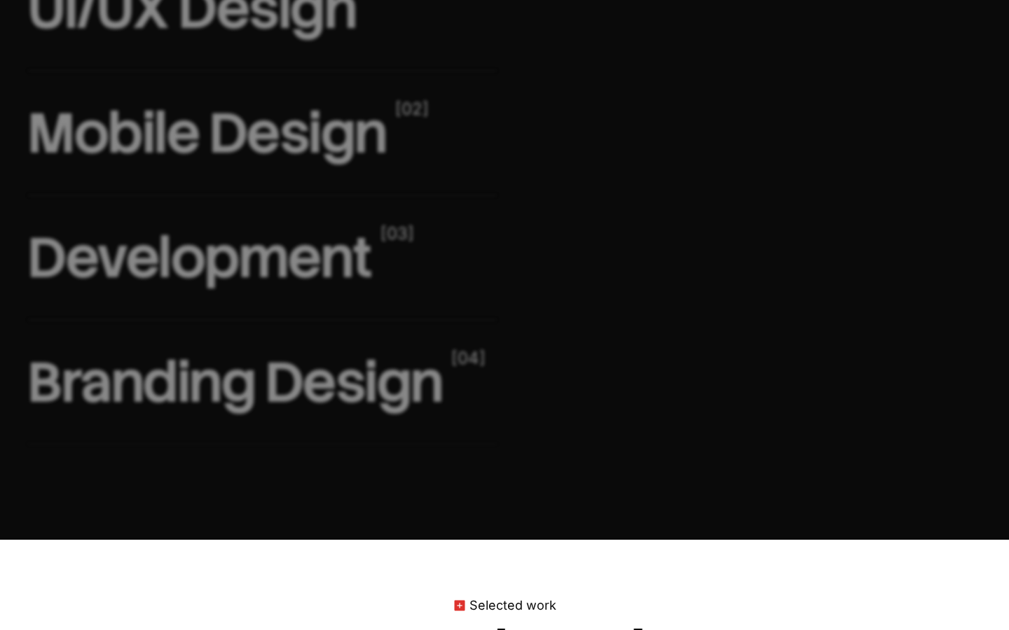
Section 6 — Services List (Dark)
Position: ~27–40% scroll (scroll-020.png lower half through scroll-030.png)
Layout: Full-bleed black background (#0A0A0A). Left-aligned vertical list of service names, each occupying its own full-width row, separated by thin horizontal rules. Small numbered tags [01], [02], [03], [04] positioned inline to the right of each service name.
Visual:
- Eyebrow at top: red square icon + "Our Services" in Inter small, white
- Service items at large scale (~56–80px, Stack Sans Headline, white, weight 700):
- "UI/UX Design" [01]
- "Mobile Design" [02]
- "Development" [03]
- "Branding Design" [04]
- Each item separated by a 1px horizontal rule in dark grey (~#2A2A2A)
- Numbered tags appear in small Inter, muted white (approximately rgba(255,255,255,0.35)), right-aligned to the service name text
- No icons, no imagery — type alone on black
Conversion rationale: The services section uses typographic scale to make each offering feel substantial. The dark background section is the second dark zone on the page (after the hero), creating a deliberate rhythm: dark (hero) → light (about, stats) → dark (services) → light (projects). This alternation makes each section feel like a new environment, extending perceived scroll engagement. The numbered tags suggest a structured methodology rather than an ad-hoc menu.
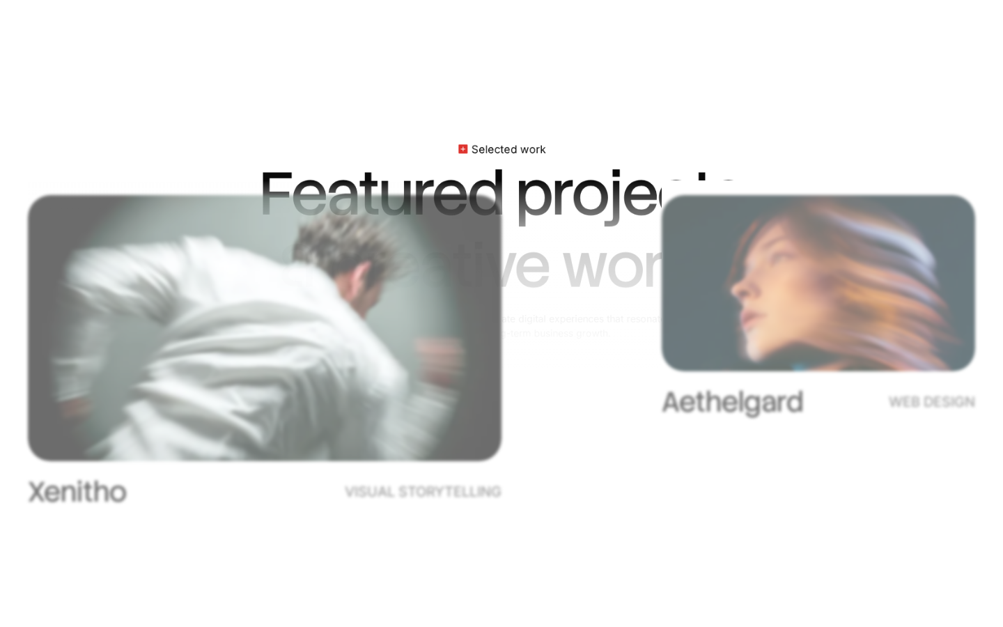
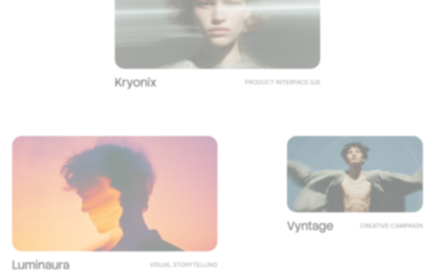
Section 7 — Featured Projects Grid
Position: 40–58% scroll (scroll-030.png lower, scroll-040.png, scroll-050.png)12px border-radius). Grid is not strictly aligned: right column cards are vertically offset from left column cards (staggered/brick layout). A "Selected work" eyebrow badge is centered above the grid. "Featured projects / 8 creative works" headline straddles both columns in large Stack Sans Headline.
Layout: Asymmetric 2-column grid on white background. Column widths are unequal — left column approximately 55% width, right approximately 40%, with a gap. Project cards are portrait-oriented rounded rectangles (
Visual:
- "Selected work" badge: small red square icon + text, centered
- Section headline: "Featured projects / 8 creative works" — Stack Sans Headline, ~64–80px, near-black, centered, the "/" is a visual divider
- Project cards use cinematic motion-blur photography — same visual DNA as the hero. Each card shows: full-bleed image fill, project name below in near-black Inter ~16px, service category label to the right in small caps grey Inter
- Xenitho / VISUAL STORYTELLING — man in white jacket, blurred motion
- Aethelgard / WEB DESIGN — woman with hair in motion blur, cool blue-grey tones
- Kryonix / PRODUCT INTERFACE (UI) — androgynous figure, face partially visible through glass/overlay
- Luminaura / VISUAL STORYTELLING — warm amber/orange tones, silhouetted figure
- Vyntage / CREATIVE CAMPAIGN — man with arms spread, blue-grey tones
- Additional cards extend below the fold
Conversion rationale: The asymmetric grid breaks the rigid template feel and signals considered visual judgment — the layout itself demonstrates design thinking. The cinematic photography style applied to project thumbnails creates visual coherence: every card uses the same motion-blur aesthetic, implying the agency's aesthetic runs through all client work. Project category labels (VISUAL STORYTELLING, WEB DESIGN) signal breadth without requiring separate service pages.
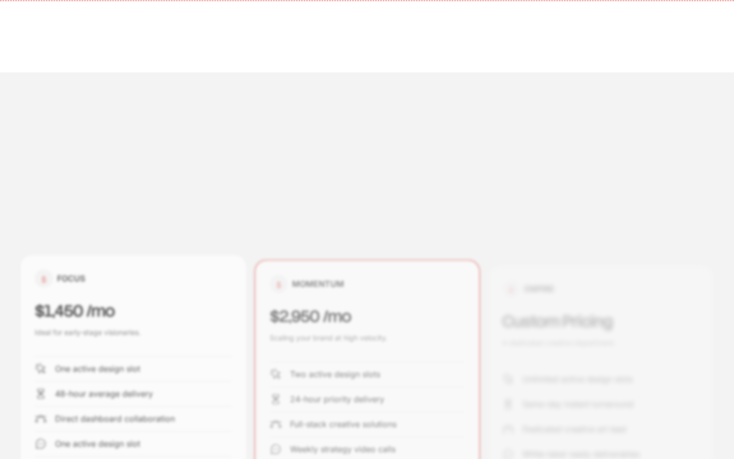
Section 8 — Pricing (Light Background)
Position: 58–68% scroll (scroll-060.png)16px), equal width, centered in a ~1200px container. The center card ("MOMENTUM") has a red-tinted border/outline suggesting it is the recommended or featured tier. A faint dashed or dotted horizontal line at the top of the section acts as a visual separator from the project grid above.
Layout: 3-column pricing card grid on very light grey background (#F2F2F2). Cards are white-fill with rounded corners (
Visual:
- Column 1 "FOCUS" — $1,450/mo — "Ideal for early-stage visionaries" — feature list: One active design slot, 48-hour average delivery, Direct dashboard collaboration, One active design slot
- Column 2 "MOMENTUM" — $2,950/mo — "Scaling your brand at high velocity" — feature list: Two active design slots, 24-hour priority delivery, Full-stack creative solutions, Weekly strategy video calls — red accent border on card
- Column 3 "CUSTOM" — "Custom Pricing" — Enterprise/custom tier, feature list visible but partially cropped
- Each pricing card has: tier label in small caps red+grey, price in Stack Sans Headline ~52px, descriptor line, bulleted feature list with small icon markers (circle/X/person icons in grey)
- No CTAs visible within the pricing cards in the captured frame — likely below the fold within the card
Conversion rationale: Pricing transparency on an agency site is a trust accelerator — it eliminates the "what does it cost?" objection before the consultation. The three-tier structure funnels visitors: FOCUS captures early-stage, MOMENTUM is the designed aspirational choice (red border as visual weight), CUSTOM captures enterprise intent. Placing pricing at ~60% scroll means visitors who reach it have already seen the portfolio — purchase intent is higher by this point.
Section 9 — FAQ (White Background)
Position: ~68–76% scroll (scroll-070.png)
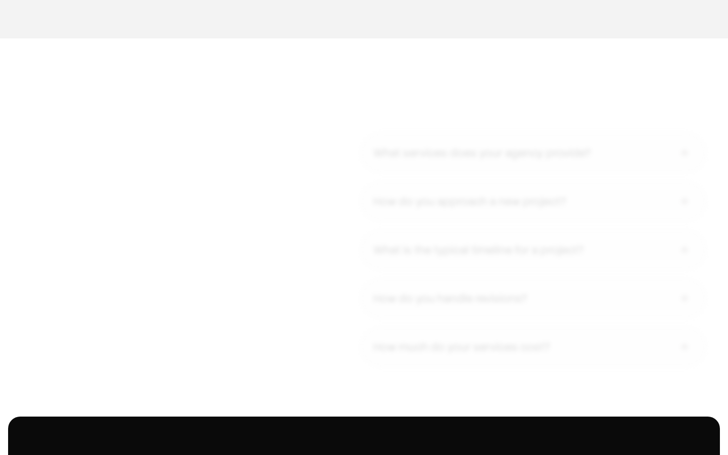
Layout: Two-column split, approximately 40/55. Left column is empty white space (or contains a sticky label — not clearly resolved from the capture). Right column: accordion-style FAQ list, question text only visible (all collapsed), with chevron arrows on the far right of each row. White background, no borders on individual rows — separated by thin 1px lines.
Visual:
- Questions visible (all collapsed): "What services does your agency provide?" / "How do you approach a new project?" / "What is the typical timeline for a project?" / "How do you handle revisions?" / "How much do your services cost?"
- Question text in Inter ~16–18px, near-black, weight 400–500
- Chevron icons at right, grey
- The
faq-wraptransition (0.3s) from cssom-transitions.json and thetransform: matrix(1,0,0,1,0,50)value indicate accordion panels animate with a translateY(50px) → translateY(0) reveal on open - FAQ section has generous top/bottom padding — approximately 80–100px above and below
Conversion rationale: The FAQ section answers objections at the moment of highest consideration — after pricing, a visitor deciding whether to book has specific process questions. The accordion format respects space while signaling thoroughness. All five questions directly address the consultation decision: services, process, timeline, revisions, cost.
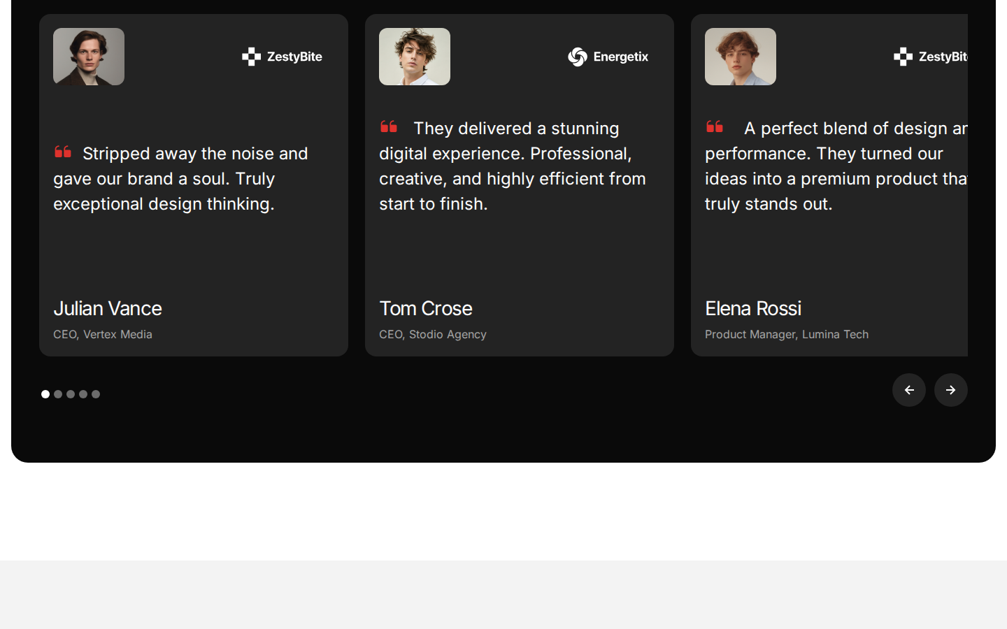
Section 10 — Testimonials Slider (Dark)
Position: 76–84% scroll (scroll-080.png)#1A1A1A, slightly lighter than the hero black), rounded outer container (
Layout: Full-bleed dark background (20px radius). 3-column testimonial card slider, visible at once. Each card is a dark grey rounded rectangle (#242424), approximately equal width.
Visual:
- Each card: portrait thumbnail (grayscale/neutral, square ~64px, rounded corners) + company logo mark (top right, white) + quotation marks icon in red (#E63329) + testimonial body text in Inter ~16px, white, weight 400 + reviewer name in Inter ~18px, white, weight 600 + role/company in Inter ~13px, muted grey
- Card 1: Julian Vance, CEO Vertex Media + ZestyBite logo — "Stripped away the noise and gave our brand a soul. Truly exceptional design thinking."
- Card 2: Tom Crose, CEO Stodio Agency + Energetix logo — "They delivered a stunning digital experience. Professional, creative, and highly efficient from start to finish."
- Card 3: Elena Rossi, Product Manager Lumina Tech + ZestyBite logo — "A perfect blend of design and performance..."
- Below cards: 5-dot pagination indicator (first dot filled/white, others grey outline) + left/right arrow buttons (dark circle buttons with ← →, right-aligned)
- The slider arrows use the
.w-slider-arrow-leftcolor + background-color 0.3stransition from cssom-transitions.json and.w-slider-dotusesbackground-color 0.1stransition
Conversion rationale: Social proof from named CEOs and product managers with company logos attached is the highest-credibility testimonial format. The dark background section creates environmental variety — the testimonials feel like a dedicated premium zone, not an afterthought. Three simultaneous testimonials show volume without requiring interaction. The slider mechanism means additional testimonials exist beyond the three shown.
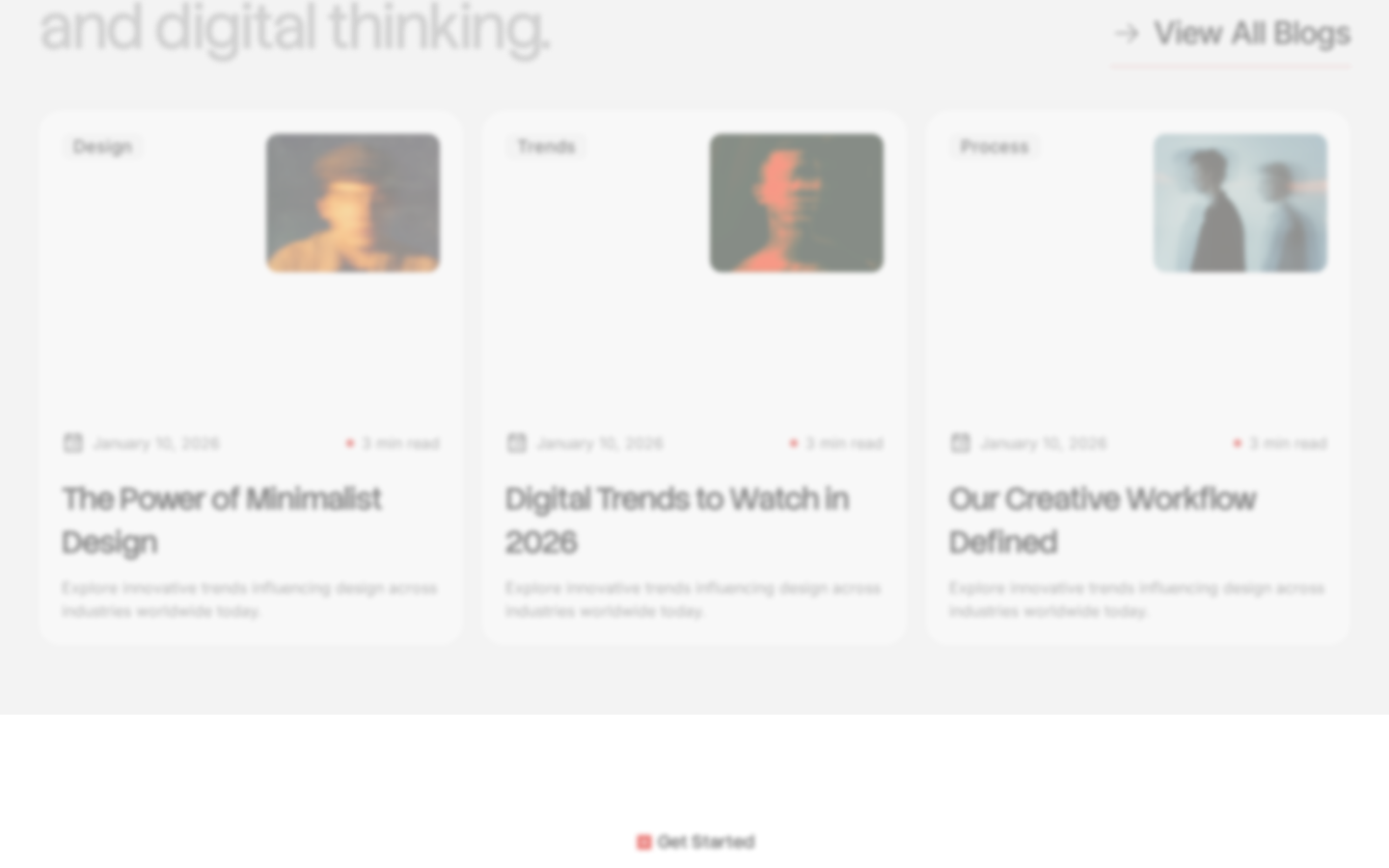
Section 11 — Blog / Insights Preview (Light)
Position: 84–92% scroll (scroll-090.png)12px), white fill, no card borders.
Layout: 3-column equal-width blog card grid on white background. Section headline spans full width, approximately 2 lines at ~64px. "View All Blogs →" text link right-aligned, aligned with the headline. Cards have rounded corners (
Visual:
- Section headline (partial, scroll-090 shows second line): "...and digital thinking." — Stack Sans Headline, ~64px, near-black, left-aligned
- "View All Blogs →" in Inter ~14px, right-aligned, light grey with arrow
- Each blog card contains: category pill (small grey text on grey pill, e.g. "Design", "Trends", "Process") + thumbnail image (right half of card, portrait crop of cinematic photography — same motion-blur aesthetic) + date + red dot + "3 min read" + headline + short excerpt
- "The Power of Minimalist Design" / January 10, 2026
- "Digital Trends to Watch in 2026" / January 10, 2026
- "Our Creative Workflow Defined" / January 10, 2026
- A "Get Started" badge (red square icon + text, centered) appears at the very bottom of this section, acting as a transition cue to the CTA section below
Conversion rationale: The blog section does dual work: it establishes thought leadership and provides SEO value. Placing it near the bottom of the page serves visitors who are still considering — they get evidence the agency thinks deeply about the industry. The "View All Blogs →" link creates an exit to content, which is intentional (the blog nurtures prospects over time). The "Get Started" badge below is a soft mid-page CTA that doesn't interrupt the reading flow.
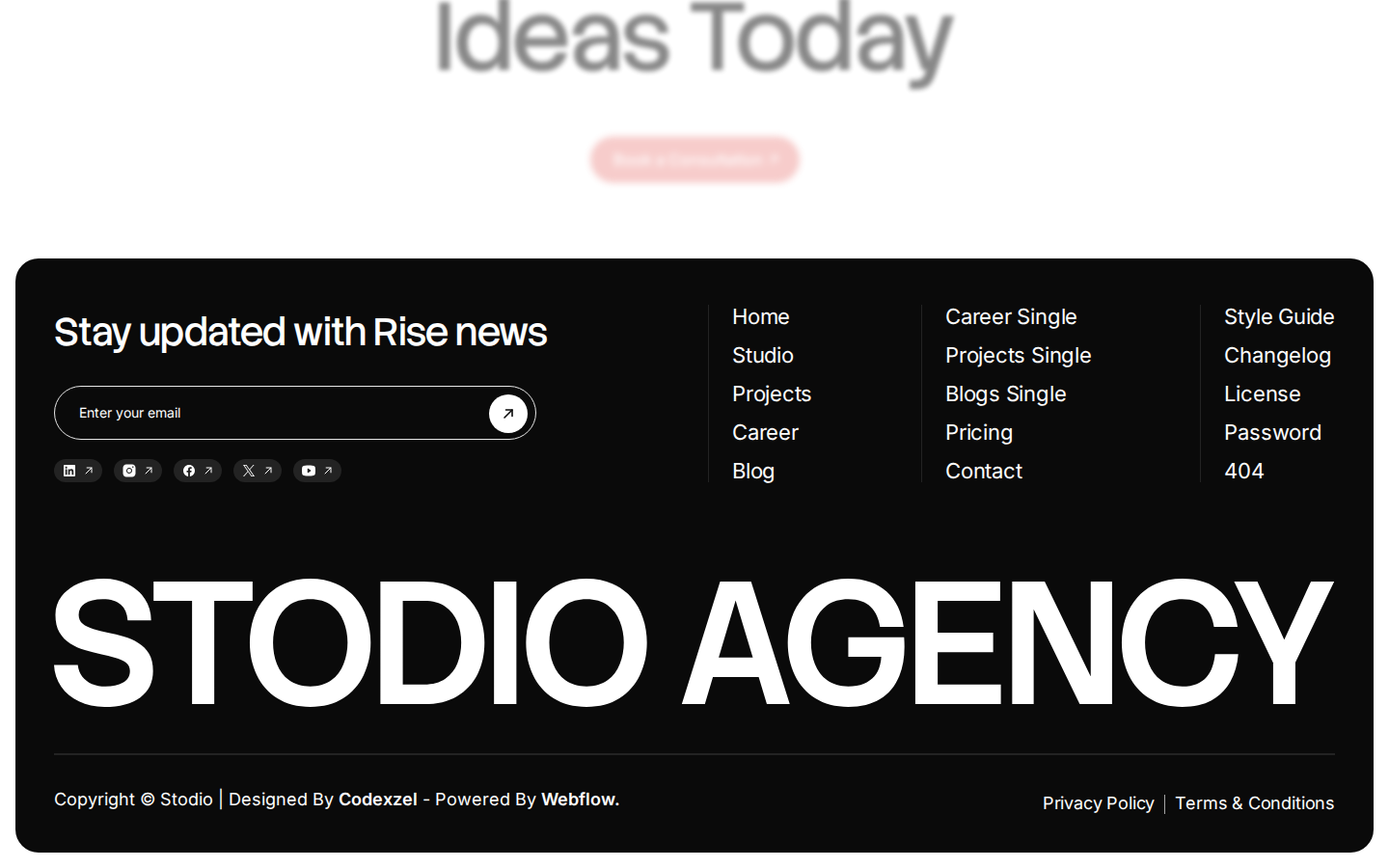
Section 12 — Pre-Footer CTA (White)
Position: ~92–95% scroll (scroll-100.png, above footer)
Layout: Single-column centered, white background. Large display headline centered. Single CTA button centered below.
Visual:
- Headline: "Transform Your / Ideas Today" — Stack Sans Headline, ~96–120px, near-black, centered, 2 lines, tight tracking. This is the largest text on the page after the footer wordmark.
- CTA button: "Book a Consultation >" — red fill (#E63329), white Inter text
15px, weight 600, pill shape (48px height, ~220px width), centered below headline - Generous vertical padding above and below — approximately 100–140px
Conversion rationale: The final CTA before the footer is the conversion culmination. After 10,000px of context-building (proof, services, portfolio, pricing, FAQ, testimonials), the page closes with the clearest possible ask. The headline frames it as the prospect's action ("Your Ideas") not the agency's pitch. The red button is the same red used consistently throughout — no new visual language introduced at the critical moment.
Section 13 — Footer (Black)
Position: 95–100% scroll (scroll-100.png)20px outer radius). Upper zone: 4-column grid. Lower zone: full-width oversized wordmark.
Layout: Full-bleed black rounded container (
Visual:
- Upper zone column 1 (left ~35%): "Stay updated with Rise news" headline in Stack Sans Headline ~24px, white + email input field ("Enter your email") in a pill with black arrow submit button + social icons row (LinkedIn, Instagram, Facebook, X/Twitter, YouTube — each in small dark pill with ↗ arrow icon)
- Upper zone columns 2–4: site navigation links in three columns — Home, Studio, Projects, Career, Blog / Career Single, Projects Single, Blogs Single, Pricing, Contact / Style Guide, Changelog, License, Password, 404 — all in Inter ~14px, white, weight 400
- Thin horizontal rule separating upper from lower zone
- Lower zone: "STODIO AGENCY" in Stack Sans Headline, weight 900, viewport-filling, approximately 160–200px, uppercase, white on black, spanning full width with tight tracking
- Below the giant wordmark: "Copyright © Stodio | Designed By Codexzel - Powered By Webflow." left-aligned + "Privacy Policy | Terms & Conditions" right-aligned — both in Inter ~12px, muted grey
Conversion rationale: The oversized footer wordmark is a brand statement, not a functional element. It creates a memorable closing frame — the last thing a visitor sees is the brand name at maximum scale. The email newsletter form captures lower-intent visitors who aren't ready to book but want to stay in the ecosystem. The comprehensive site navigation in the footer serves navigation-heavy visitors who scroll to the bottom looking for specific links rather than committing to the primary CTA.